Shoppable Funnels
Ecommerce Landing Pages: The Ultimate Guide

Sakshi Gupta






Most ecommerce landing page advice treats the landing page as one thing. It is five things, and picking the wrong pattern is a bigger error than any headline test will recover. This covers the five patterns, the anatomy they share, and the shift that matters most: the right pattern is decided by where the visitor came from, which means you can serve all five from a single URL rather than maintaining one page per campaign.
Who this is for: ecommerce and growth leads sending paid, organic or AI traffic somewhere and unsure it should all be the same somewhere.
The five patterns
The dedicated product lander. One SKU, full argument, direct buy.
The advertorial. Editorial framing that earns the pitch before making it.
The comparison page. For buyers already in evaluation mode.
The collection lander. A curated subset for a themed campaign.
The quiz or finder. For catalogs where choosing is the hard part.
The right one is determined by how much your visitor already knows when they arrive, which is determined by where they came from. Hold that thought, it is the whole argument.
The anatomy all five share
Six things, in roughly this order.
1. Match the promise that got the click. If the ad said "merino wool runners, machine washable", those words appear above the fold. This is the most reliable predictor of whether a page converts, and the most commonly broken thing when campaigns scale, because ads get iterated and pages do not.
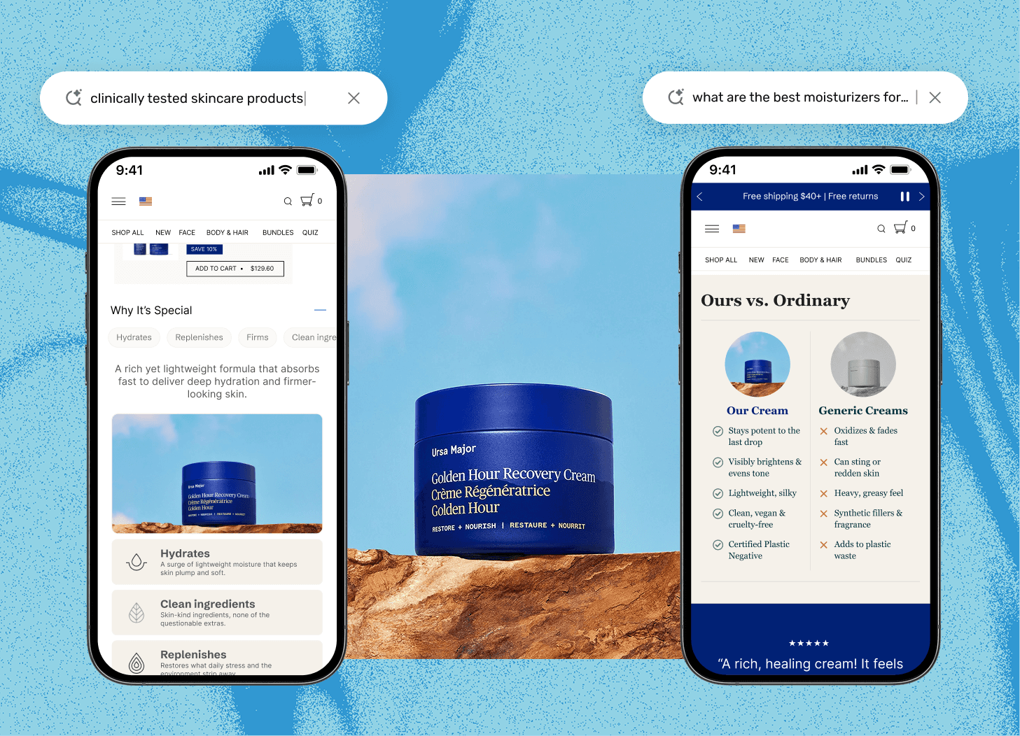
2. Show the product immediately. Not a lifestyle mood shot. The thing, clearly, at a size where material and construction read.
3. Answer the disqualifying question early. Every category has one thing that stops a purchase cold. Sizing for apparel. Compatibility for accessories. Ingredients for supplements. Delivery timing for gifts. If a visitor has to hunt for it, a share of them leave instead.
4. Give the reason to believe. Reviews with volume, specific claims with substantiation, certification where it is real. Generic five star widgets with no count do less than nothing, because buyers discount them automatically.
5. Make price and availability unambiguous, including shipping cost and returns. Hidden shipping revealed at checkout remains one of the largest single sources of abandonment.
6. One primary action, repeated at natural decision points, not five competing buttons in one viewport.
That is the landing page structure baseline. The patterns differ in how they sequence it.
Pattern 1: The dedicated product lander
What it is: a single product, argued properly, with a buy action.
When it wins: high consideration single SKU purchases where the product page is too thin to carry the argument. Anything with a mechanism to explain, a price to justify, or a claim needing evidence.
Why not just send traffic to the PDP: a product page is a compromise. It serves someone who arrived from a brand search and already decided, someone who has never heard of you, and someone comparing three options. A lander only has to serve the third.
What to check: the mechanism section. Most product landers assert a benefit and skip why the product delivers it. The ones that convert explain it in one clear paragraph or one diagram.
How to serve it: Nudge Funnels generates the lander from your catalog rather than requiring it to be built by hand, so price, variants and stock stay live. Because it is generated, one product lander per SKU stops being a resourcing question.
Pattern 2: The advertorial
What it is: a page that reads as editorial before it reads as a pitch. A story, a problem, a discovery, then the product as resolution.
When it wins: cold prospecting traffic, especially paid social, where the visitor did not go looking for you and has no reason to accept a sales argument in three seconds.
Why it works: it buys attention before spending it. A cold visitor who lands on a hard pitch bounces. The same visitor will read 600 words of a story describing a problem they recognise.
Where it goes wrong: advertorials that are transparently advertorials from the first line get neither the credibility of editorial nor the efficiency of a direct pitch. There are also real disclosure obligations. If the page reads as editorial it must be clearly identifiable as advertising.
How to serve it: this pattern should receive cold paid social and almost nothing else. Channels routes it to exactly that origin, so your brand search traffic is never dropped into a 600 word story when they were ready to buy.
Pattern 3: The comparison page
What it is: your product against the alternatives, including honest concessions.
When it wins: mid funnel traffic in evaluation mode, and increasingly traffic arriving from an AI assistant, because assistants routinely frame shopping answers as comparisons and the visitor arrives already thinking in a comparison set.
Why it matters more than it used to: when someone asks an assistant to compare options in your category, the assistant needs sources, and comparison content is what it reaches for. A page that fairly compares you against named alternatives is both a conversion asset and a citation asset.
The rule that makes it work: concede something real. A comparison page where you win every row is not persuasive to a human and not useful to an assistant. Name the case where a competitor is the better choice.
How to serve it: this is the highest value pattern to route by origin, because the traffic that needs it is identifiable. Nudge AI Visibility shows which shopping questions you appear in through Answer Engine Insights, so you know which comparisons are actually being run about your category. Funnels then serves the comparison page to visitors arriving from those answers, while everyone else gets a pattern suited to them.
Pattern 4: The collection lander
What it is: a curated subset of the catalog around a theme, season, occasion or audience.
When it wins: campaigns where the offer is a selection rather than a product. Gifting, seasonal, new arrivals, a category launch.
Why the default collection page underperforms it: a standard collection page is a grid with filters. A collection lander adds the editorial layer explaining why these products, for whom, and in what order to consider them. That layer converts browse intent into a decision.
What to check: whether the page is curating or just filtering. If the only difference from your standard collection page is a banner image, it is not a landing page.
How to serve it: Personalized Storefronts assembles the collection from live catalog data, so a gifting edit does not surface items that went out of stock the week you launched it.
Pattern 5: The quiz or finder
What it is: a short guided path ending in a recommendation.
When it wins: catalogs where the barrier is choosing, not believing. Shade matching, sizing, skin or hair type, fit, compatibility.
The tradeoff: every question costs completion. The best ones ask three to five, show progress, and let people skip to browsing. Quizzes that ask twelve before revealing anything convert a small qualified minority and lose everyone else.
The underrated benefit: the answers are first party intent data, and they tell you what your catalog is missing.
How to serve it: route it to origins where intent is broad rather than specific. Someone who searched a precise product name does not need a quiz, and giving them one adds friction to a visitor who was ready.
The shift: pattern follows origin
Here is where most landing page programs go wrong, and it is not about design.
Teams choose the pattern based on the product. The better input is how much the visitor already knows on arrival, which is a property of the traffic source.
Three visitors to the same product:
One clicked a broad prospecting ad on Instagram. Never heard of you, was not shopping, knows nothing. Needs the advertorial.
One searched your brand plus the product name. Decided, looking for a reason not to buy. Needs the product lander, or honestly just the product page, fast.
One arrived from a Perplexity answer comparing four brands. Has had the evaluation done for them, knows the alternatives by name, is checking your claims. Needs the comparison page.
Send all three to the same URL and at least two get a page built for someone else. No headline test fixes that, because the winning headline for one is the wrong opening for the others.
Pattern by origin
Traffic origin | What they already know | Pattern to serve | Served by |
|---|---|---|---|
AI assistant answer | Alternatives by name, criteria already framed | Comparison page | Nudge Funnels |
Agent acting for a buyer | Needs machine legible facts, will not render design | Agent ready version of the page | Nudge Funnels |
Cold paid social | Nothing, was not shopping | Advertorial | Nudge Funnels |
Retargeting | Product already viewed | Product lander | Nudge Funnels |
Brand search | Decided | Product page, fast | Your existing PDP |
Broad category search | Category but not product | Quiz or collection lander | Nudge Funnels |
Email and SMS | Existing customer, knows the brand | Collection lander | Nudge Funnels |
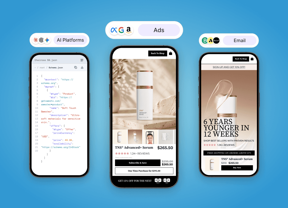
This is what Nudge Funnels is for: one URL that assembles the journey each click deserves based on origin, whether that is a Meta ad, an organic result, an AI assistant answer or an agent shopping on a buyer's behalf. Channels does the routing, so the same link works in every ad, email and listing. Pages live on your own domain, so authority and any citations accrue to your brand rather than a vendor hosted copy. And Autonomous Experimentation runs every routed version against a control, so you find out whether routing actually won rather than assuming it did.
If you are still choosing a tool to build these in, the tradeoffs are in our landing page builders for ecommerce comparison.
How to test a landing page without fooling yourself
Test against a real control. The control is your current best page receiving the same traffic at the same time, not last month's numbers. Seasonality and mix changes will otherwise hand you a result that is not there.
Measure revenue per visitor, not conversion rate. A page can lift conversion rate and lower revenue by pulling people toward a cheaper product. Revenue per visitor catches that.
Segment by traffic origin before concluding anything. An average across paid social, organic and AI referral traffic can hide a page that won decisively with one and lost with another. When that happens the answer is usually not a better page. It is two pages, which is the argument this whole post has been making.
Frequently asked questions
What is an ecommerce landing page?
A page built for one specific traffic source with one specific next action, as opposed to a product or category page built to serve every visitor. It matches a campaign's promise, makes one argument, and offers one primary action.
What makes a good ecommerce landing page?
Message match with the ad or query that drove the click, the product shown clearly and early, the category's disqualifying question answered before it is asked, credible proof with specifics, unambiguous price and shipping, and a single repeated call to action.
Should I send ads to a landing page or a product page?
Send warm, decided traffic to the product page, because speed matters more than argument for someone who has already chosen. Send cold or comparison stage traffic to a landing page. With origin based routing in Nudge Funnels you can serve personalized funnels across ads.
What is a good ecommerce landing page conversion rate?
It varies too widely by category, price point and traffic source for a single benchmark to be useful. Track your own page against your own control, measured in revenue per visitor and segmented by traffic origin.