CRO & Experimentation
6 Practical A/B Testing Examples & Case Studies for Digital Marketing Growth
Explore 6 practical examples of A/B testing in digital marketing and how small changes can increase conversions, AOV, and user engagement.

Sakshi Gupta


Introduction
Have you been curious about why some of your digital marketing campaigns perform better than others? Or why certain website elements drive higher engagement while others fall flat? A/B testing offers the answers, helping you identify what truly resonates with your audience and optimize your campaigns for better conversions.
In fact, 96% of e-commerce retailers that ran at least three price tests found a better price, showing the direct impact of testing on improving business outcomes. As an e-commerce marketer, growth manager, or digital strategist, the ability to test and optimize continuously is essential for improving results.
In this article, you'll explore six practical examples of A/B testing from real businesses and case studies, providing you with actionable insights to help drive your own digital marketing growth.
At a glance
A/B testing allows marketers to test variations of digital elements (e.g., CTAs, landing pages) to improve performance.
Real-world case studies show how small changes, like color swaps or simplified navigation, can significantly boost conversions.
Creating a clear, measurable hypothesis is key to successful A/B testing.
Personalization, through tools like Nudge, enhances A/B testing by delivering real-time, AI-driven adjustments without developer involvement.
Testing one element at a time and measuring key metrics ensures reliable, actionable results.
How to Do A/B Testing?
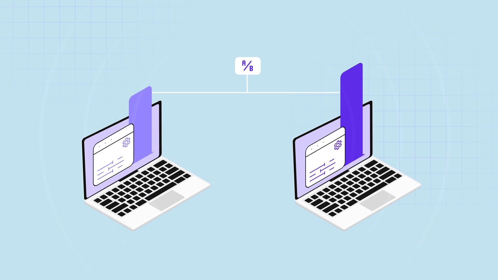
A/B testing is a method of comparing two versions of a webpage or marketing asset to determine which one performs better. By making data-driven decisions, A/B testing helps marketers refine their strategies and improve performance. The goal is to continuously optimize elements such as layout, content, and user experience for better results.
How to Do A/B Testing:
Set a Clear Objective: Define what you want to test (e.g., increasing conversions, reducing bounce rates) and how you will measure success.
Choose a Variable: Select one element to test at a time (e.g., CTA button, image, headline) to isolate its impact.
Create Two Versions: Design two variants (A and B), with one key difference between them.
Split Your Audience: Randomly divide your traffic between the two versions to ensure equal and unbiased exposure.
Collect Data: Monitor key metrics like conversion rates, engagement, or clicks to determine the winner.
Analyze Results: Review the data to identify which version performed better, using statistical significance to confirm the findings.
Implement and Optimize: Apply the winning variant and continue testing other elements to further optimize your strategy.
These steps set the foundation for running your own A/B tests, but crafting a strong hypothesis will help guide your experiments.
A/B Testing Hypothesis Examples
Creating a strong hypothesis is the basis of any successful A/B test. A clear and focused hypothesis helps you understand exactly what you're testing and why. It defines what you expect to happen if a specific change is made, and it allows you to measure the impact of that change on key metrics.
The hypothesis should be:
Focused on one specific problem or opportunity.
Measurable, meaning it can be proven or disproven based on data.
Action-oriented, aimed at creating an impact, like improving conversion rates or reducing bounce rates.
An easy way to structure your hypothesis is using an "If, then" format. For example: "If I change this element, then I expect this result to happen." This approach helps you stay focused on the problem and clearly define the expected outcome.
A/B Testing Hypothesis Examples:
Example 1: "If I reduce the number of fields in the contact form to just the essentials, then form submissions will increase."
This hypothesis targets user friction; fewer fields make forms easier to complete.
Example 2: "If I change the CTA text from 'Learn More' to 'Get Started Now,' then click-through rates will rise."
This focuses on using more direct, action-oriented language to encourage user engagement.
Example 3: "If I offer a 10% discount for purchases over $50, then cart value will increase."
A targeted offer is aimed at driving larger purchases.
Example 4: "If I use images that are directly related to the blog content, then bounce rates will decrease."
Relevant visuals can help visitors connect with the content, keeping them on the page longer.
Example 5: "If I personalize email greetings with the recipient's name, then the click-through rate will increase."
Personalization is proven to increase engagement and improve response rates.
With these examples, you now have a better understanding of how to frame your own hypotheses for A/B testing. This will help you set clear expectations and measure the impact of your tests on business outcomes.
Now, let's look into some real-world A/B testing case studies to see how these hypotheses come to life in successful campaigns.
6 Practical A/B Testing Case Studies
Real-world case studies offer valuable insights into how businesses use A/B testing to refine their digital marketing strategies and increase conversions. By learning from these examples, you can apply similar strategies to your own campaigns, making data-driven decisions that improve user experience and performance.
Below are 6 practical A/B testing case studies where businesses tested different strategies and saw measurable growth.
1. Performable
Performable is a marketing automation company that helps businesses enhance conversion rates through optimized digital strategies, focusing on driving better user engagement and marketing performance.
Challenge:
The team wanted to determine if the color of the CTA button could impact conversion rates.
The digital marketing world is filled with opinions on which button color works best: green, red, blue, etc.
Performable needed to test if the color choice could lead to increased clicks and conversions on their homepage.
A/B Test Method:
Variant A (Original): The homepage featured a green CTA button that blended seamlessly with the site's color scheme.
Variant B (Test): The CTA button was changed to a bold red color, designed to grab attention and stand out more.
The hypothesis was that the red button would attract more clicks, even though red is traditionally associated with "stop."
Results:
The red button outperformed the green one by a 21% higher click-through rate.
This A/B test demonstrated that a simple design change, like the color of a button, could significantly improve engagement.
The results challenged assumptions, showing that breaking from conventional design practices (like red signaling "stop") could still yield positive results in certain contexts.
2. TechInsurance
TechInsurance specializes in providing customized insurance solutions for small businesses, with a focus on tech companies. Their platform helps businesses find the right insurance coverage based on their unique needs.
Challenge:
PPC campaigns were driving traffic to the generic homepage, which didn't resonate with the specific needs of their paid traffic audience.
The team needed to determine if a more targeted landing page, aligned with the ad messaging, would improve conversion rates.
The hypothesis was that a dedicated landing page would better align with the PPC audience's intent and increase engagement.
A/B Test Method:
Variant A (Original): The traffic was directed to TechInsurance's generic homepage, which didn't cater specifically to PPC ad traffic.
Variant B (Test): A dedicated landing page was created specifically for PPC visitors, designed with content and CTAs that directly addressed their needs.
The team aimed to test whether a more focused landing page would increase conversions by providing a more relevant and personalized experience.
Results:
The dedicated landing page outperformed the homepage, leading to a 73% increase in conversion rates.
This significant uplift showed the value of aligning landing page content with the specific audience's needs and expectations.
The test confirmed that a personalized experience leads to higher engagement and conversion, reinforcing the importance of personalization in digital marketing.
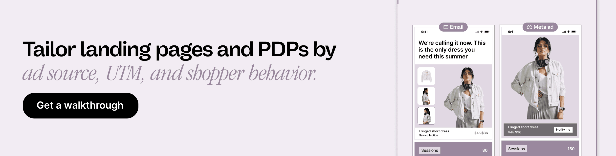
Struggling to personalize landing pages quickly without relying on developers?
Nudge offers real-time AI-powered content adjustments, enabling marketers to test and optimize landing page variations instantly, ensuring the right message reaches the right audience without the need for extensive development.

3. Grene
Grene is a leading Polish e-commerce company specializing in agricultural products. They provide a wide range of items for farming, gardening, and home improvement.
Challenge:
The mini cart design was cluttered, confusing, and led to high cart abandonment rates.
Users struggled to navigate the cart, especially when interacting with the "Free Delivery" label that looked like a clickable button.
Grene needed to improve the user experience to reduce friction and increase the number of completed purchases.
A/B Test Method:
Variant A (Original): The original mini cart had a confusing layout, with unclear CTAs and a difficult-to-find "Go To Cart" button.
Variant B (Test): Grene revamped the mini cart, adding clear CTAs, a "remove" button for items, and a more visible "Go To Cart" button.
The goal was to simplify the cart and make it easier for users to proceed to checkout without distractions or confusion.
Results:
After the redesign, Grene saw a 2X increase in purchases and a slight improvement in conversion rates.
The redesign streamlined the user journey and helped users complete their purchases with fewer obstacles.
This case demonstrated how even small changes to the user interface can lead to significant improvements in e-commerce performance.
4. Vancouver 2010 Olympic Store
The Vancouver 2010 Olympic Store sold official merchandise related to the Winter Olympics, including memorabilia and apparel.
Challenge:
The multi-step checkout process was contributing to cart abandonment, as customers found it too time-consuming.
Vancouver 2010 Olympic Store needed to test whether a simplified, single-page checkout would improve the conversion rate.
The team hypothesized that reducing the number of steps in the checkout process would result in higher completion rates.
A/B Test Method:
Variant A (Original): The traditional multi-step checkout process with several pages to complete the order.
Variant B (Test): A streamlined, single-page checkout that consolidated all the steps into one page.
The goal was to see if reducing the number of steps would lower abandonment rates and improve conversion.
Results:
The single-page checkout resulted in a 21.8% increase in conversion rates compared to the multi-step checkout.
This test highlighted that simplicity and speed in the checkout process could significantly improve user experience and drive conversions.
It also emphasized the importance of aligning the checkout process with user expectations for a smoother purchase experience.
Is your checkout flow causing cart abandonment with too many steps?
With Nudge, you can instantly test variations of your checkout page, optimizing for faster, more efficient user experiences that drive higher conversion rates.

5. HubSpot
HubSpot is an inbound marketing and sales software company that helps businesses attract visitors, convert leads, and delight customers through automation and personalized marketing.
Challenge:
HubSpot wanted to improve engagement with its weekly email campaigns and increase click-through rates (CTR).
The team suspected that the alignment of text within their emails could influence how users interacted with the content, specifically the CTAs.
The hypothesis was that left-aligned text would improve readability and, in turn, drive more clicks.
A/B Test Method:
Variant A (Original): Emails with centered text, the format that had been used in previous campaigns.
Variant B (Test): Emails with left-aligned text, designed to improve readability and make the CTAs stand out more.
The test aimed to determine whether left-aligned text would lead to higher engagement compared to the centered text format.
Results:
The results were unexpected: left-aligned text performed worse than the centered text, receiving fewer clicks overall.
Less than 25% of the left-aligned email variants outperformed the control group.
This outcome demonstrated that small details like text alignment can have a significant impact on email marketing performance, and marketers should continuously test these elements.
6. FSAstore.com
FSAstore.com is an e-commerce platform that specializes in products eligible for Flexible Spending Accounts (FSAs), meeting the needs of individuals with FSA benefits.
Challenge:
FSAstore.com's website had an overwhelming number of navigation options, which led to decision fatigue and lower conversion rates.
The site's cluttered navigation made it difficult for customers to quickly find what they needed, resulting in abandoned purchases.
FSAstore.com needed to simplify the site's navigation to improve user experience and increase conversions.
A/B Test Method:
Variant A (Original): The existing site, which included a detailed subheader in the navigation and too many options on category pages.
Variant B (Test): A simplified version of the website with fewer options and the removal of the subheader, focusing on making the navigation more intuitive.
The test aimed to measure whether a simplified experience would lead to higher revenue per visitor.
Results:
The simplified site led to a 53.8% increase in revenue per visitor.
This test demonstrated that a clear, user-friendly navigation structure can greatly improve conversions and overall sales.
The results also showed that less can often be more when it comes to user interface design, reinforcing the importance of simplicity.
These case studies highlight the power of A/B testing to drive impactful changes, but to make the most out of your own tests, understanding the key takeaways is essential for optimizing your marketing strategies.
A/B Testing Takeaways for Marketers
A/B testing isn't just about running tests; it's about learning from them and applying those insights to improve future strategies. By testing different elements, marketers can identify what works best for their audience, driving better engagement and higher conversions.
Here are the key takeaways for marketers to keep in mind when implementing A/B tests:
Start with a Clear Hypothesis: A well-defined hypothesis helps ensure that your test is focused and measurable, leading to actionable insights.
Test One Element at a Time: Focusing on a single variable (e.g., CTA button color or copy) ensures you can isolate its impact and make data-driven decisions.
Segment Your Audience: Personalize tests to different audience segments to understand how specific groups respond to variations in content or design.
Track and Measure Key Metrics: Always track the metrics that matter most (e.g., conversion rate, click-through rate) to understand the success of your test.
Use Results to Optimize: A/B testing should be an ongoing process; use the results to refine and improve future tests and campaigns.
Learn from Negative Results: Not every test will yield positive results, but understanding why something didn't work is just as valuable as a successful test.
Understanding these insights will help marketers run more effective A/B tests and apply the findings to improve overall digital marketing strategies.
How Can Nudge Help with A/B Testing in Digital Marketing?
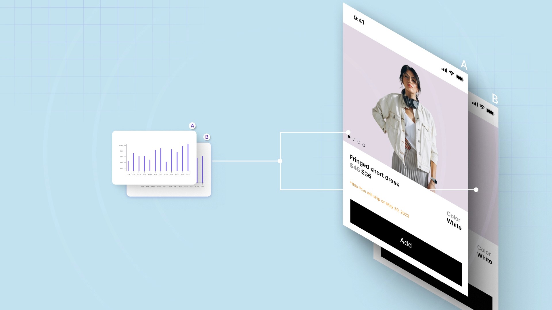
Nudge is an AI-powered platform that enables real-time personalization and A/B testing of digital marketing elements. Marketers can optimize user experiences, run tests, and gather insights instantly, all without needing developer resources.
Here's how Nudge can help with A/B testing in digital marketing:
Real-Time Personalization: Instantly test and adjust homepages, landing pages, and checkout based on shopper behavior and campaign source, optimizing for conversions in real-time.
Commerce Surfaces: Quickly create and test dynamic product grids, personalized offers, and shoppable videos tailored to user behavior and intent.
AI-Powered Product Recommendations: A/B test context-aware recommendations and smart bundles across PDPs and carts to see what increases engagement and sales.
Contextual Nudges: Test banners, pop-ups, and modals triggered by behaviors like exit intent or scroll depth, driving conversions with personalized messages.
No Dev Bottlenecks: Marketers can launch and iterate tests without code, reducing reliance on engineering teams and speeding up the testing process.
Continuous Learning: Nudge's AI learns from every interaction, ensuring that tests stay relevant and drive better results.
With these capabilities, Nudge allows you to seamlessly run A/B tests and refine your digital marketing strategies without the need for development resources.
Wrapping Up
A/B testing is a powerful strategy for optimizing digital marketing campaigns by testing and refining elements like CTAs, landing pages, and content to drive better results. The case studies showcased how small changes can lead to significant improvements in conversion rates and user engagement.
Nudge makes A/B testing and real-time personalization effortless for marketers, enabling instant adjustments and dynamic content without developer resources. With Nudge, you can continuously optimize your digital marketing strategies for maximum performance.
Book a demo today to see how Nudge can help improve your A/B testing and personalization efforts!
FAQs
1. What are the key benefits of A/B testing in digital marketing?
A/B testing helps businesses identify the most effective strategies by comparing variations of elements like CTAs, headlines, and images. It leads to improved conversion rates, higher engagement, and better user experiences.
2. How long should I run an A/B test to get accurate results?
The duration of an A/B test depends on your website traffic and the metric you're measuring. Ideally, tests should run for at least 1-2 weeks to ensure enough data is collected for statistically significant results.
3. What common mistakes should I avoid when conducting A/B tests?
One common mistake is testing too many variables at once, which can make it difficult to pinpoint the cause of any changes in results. Always test one element at a time for clear insights.
4. How can I measure the success of my A/B tests?
Success is measured by comparing key performance metrics like conversion rate, click-through rate, or sales figures between the two variants. Use statistical significance to determine the validity of the results.
5. How can Nudge help with A/B testing and personalization?
Nudge provides real-time, AI-powered personalization, enabling marketers to run A/B tests without relying on developers. It optimizes digital experiences across websites and landing pages, helping businesses quickly iterate and achieve better performance.