User Engagement
The Ultimate Landing Page Checklist for 2025
Discover the landing page checklist for 2025 to optimize structure, UX, SEO, and copy, ensuring your landing pages are personalized for every shopper.

Kanishka Thakur
Aug 19, 2025

Landing pages have become the gateway to success in modern e-commerce. For DTC brands, they’re not just a source for traffic; they’re where conversions take place.
Whether you’re running a flash sale, launching a new product, or capturing leads, a landing page is where users decide to engage or leave. With 2025 expected to be even more competitive, relying on guesswork is no longer an option.
The landing page checklist given in this blog will ensure that every element of your page, from product recommendations to CTAs, is optimized to load fast, capture attention, and convert visitors into customers.
Key Takeaways
A high-converting landing page flows seamlessly, starting with a strong hero section, addressing the problem, presenting the solution, and ending with a clear CTA.
Compelling copy resonates with users, builds trust, and drives action, directly aligning with shopper needs and behavior.
A smooth user experience is vital, as clutter, confusing navigation, or accessibility issues can drive users away from key e-commerce touchpoints.
SEO optimization ensures higher rankings, attracting the right traffic, and improving engagement for better conversions.
Landing pages should be personalized for every shopper and iteratively optimized through A/B testing and data analysis to improve performance.
What Is a Landing Page?
A landing page is a dedicated web page designed to encourage a specific action, whether that’s making a purchase, signing up, or downloading an app. Users arrive here after clicking on a targeted ad, social media post, or promotional offer. Unlike a homepage, a landing page avoids distractions, focusing solely on guiding users toward one clear next step.
For e-commerce businesses, the landing page should be purpose-built for that specific goal, ensuring that each section, image, and button contributes to a seamless and intuitive experience. Whether you’re offering a physical product, digital service, or app, every element should be aligned with the user’s expectations and designed to reduce friction, helping them make a fast, informed decision.
Nudge’s AI-driven platform optimizes landing pages, PDPs, and checkout in real time, personalizing content based on user behavior and past interactions. It uses AI product recommendations, contextual nudges, and bundling strategies to drive conversions.
Next, we will explore why landing pages are so important and how they can impact your business goals.
Why are Landing Pages Important?
Landing pages are no longer optional; they are a critical part of the e-commerce journey, shaping how users interact with your product and make purchase decisions. Here's why landing pages are essential in today’s DTC market:
Clear Value Proposition: Instantly communicates the value of your product with a benefit-driven message that resonates with shoppers.
Targeted Messaging: Personalizes content based on ad context, source context, location, and past shopper behavior like browsing, added to cart, and category affinity, ensuring the message speaks directly to the right audience.
Focused User Experience: Removes distractions from landing pages, PDPs, and checkout, ensuring a seamless experience that keeps users on track to complete their purchase.
Performance Tracking: Tracks conversion rates, user behavior, and campaign effectiveness across commerce surfaces to refine and optimize your approach.
With Nudge, e-commerce landing pages adjust to real-time user behavior, ensuring personalized content, targeted recommendations, and effective contextual nudges to drive conversions and reduce cart abandonment.
Suggested Read: Top 10 Practices for Dynamic Landing Pages in 2025 with Examples
Now that we understand their importance, let’s look into the key metrics that matter when evaluating the performance of a landing page.
Landing Page Metrics That Matter
To make smart decisions and improve results over time, you need to know which numbers actually reflect success. Below are the key landing page metrics every e-commerce website should be tracking regularly:
Conversion Rate: Measures the percentage of users completing the desired action, whether it’s making a purchase, signing up, or adding to the cart.
Bounce Rate: Tracks the percentage of users who leave after viewing only one page, without engaging further with PDPs, PLPs, or checkout.
Time on Page: Longer time on page doesn’t always indicate success, users may be stuck or unsure. A shorter, engaged session is more valuable.
Scroll Depth: Shows how far users scroll on landing pages and whether they reach crucial sections like testimonials or CTAs.
CTA Click Rate: Tracks how many users interact with your primary call-to-action, regardless of whether they convert.
Suggested Read: Understanding Click-Through Rate (CTR): Definition and Importance
With these metrics in mind, let’s move on to the ultimate checklist for creating landing pages that perform well in 2025.
A Comprehensive Landing Page Checklist for 2025
Landing pages need to be optimized for speed, personalization, and seamless user experiences. With a checklist, you can ensure that your landing page addresses the essentials, from engaging copy to a compelling CTA. The following checklist will help you ensure that your page is equipped to meet the demands of modern consumers.
The Landing Page Structure Checklist
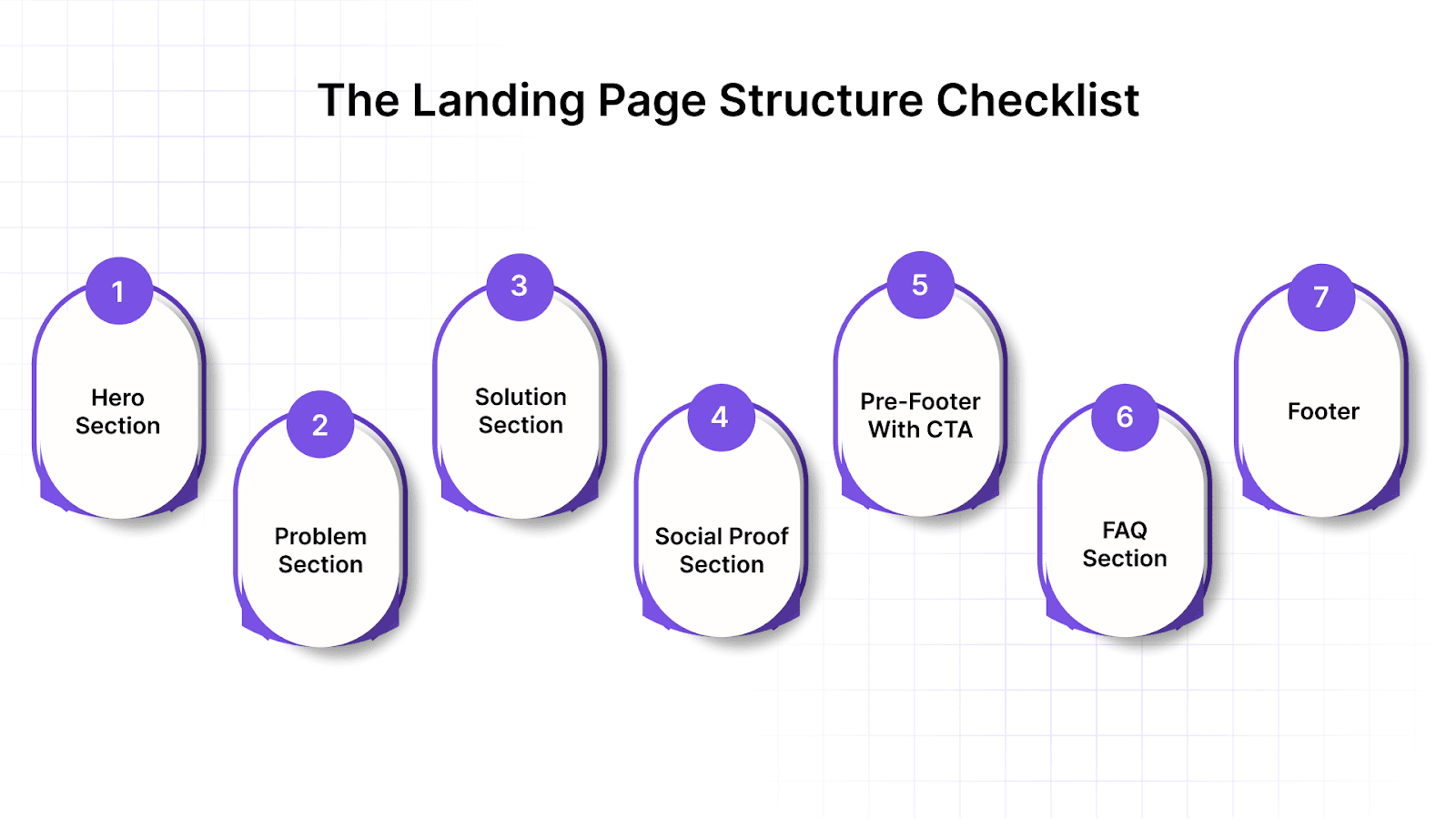
You need to ensure your landing page aligns with e-commerce pillars such as PDPs, PLPs, shopping carts, and checkout, all while providing a personalized experience. Below is a breakdown of the key sections your landing page should include in 2025:
1. Hero Section
This is your first, and possibly only, chance to make users stay. Everything above the fold should deliver immediate clarity and value.
Clear headline with a value hook: Immediately communicate the core benefit your product offers, drawing from past shopper behavior and ad context.
Sharp subheadline with 5–8 words of context: Add a short, supporting line to explain what you do or who it’s for. This helps users validate that they’re in the right place.
Supporting visual (product image, app interface, etc.): Use a clean, relevant image that shows the product or service in use. People process visuals faster than text, so this element carries more weight than you think.
Primary CTA button above the fold: Ensure one clear and visible action button users can click without scrolling. This is essential for funnel personalization.
2. Problem Section
This section sets up the need for your solution by helping users feel understood. It builds tension that your product or service is positioned to resolve.
Frame the user pain point clearly: Directly address the frustrations or inefficiencies users face, speaking their language based on insights from category affinity and browsing behavior.
Avoid jargon; speak their language: Use terms your audience would actually say when describing their issue. Pull this language from reviews, chat logs, or community forums to make it real.
Keep it to 2–3 sentences max: The goal is emotional recognition, not explanation overload. Be brief, clear, and targeted so users stay engaged.
Also Read: How to Create Effective ABM Landing Pages That Convert
3. Solution Section
Now that you’ve shown the problem, present your solution with clarity and confidence. This is where users decide if what you’re offering is worth considering.
Product or service breakdown: Focus on how your product works and delivers the solution. Highlight the AI product recommendations that adjust to user behavior.
Bullet format works well here: Break down the benefits in simple, skimmable bullets for easy reading. This makes the section easier to digest, especially on mobile.
Ratings and reviews: Use star ratings or short video reviews to build trust, integrating these within commerce surfaces like PDPs and shopping bags.
4. Social Proof Section
Most users won’t just take your word for it; they want validation from others. For e-commerce and DTC brands, social proof is essential to building trust and overcoming customer hesitation.
Real user testimonials: Display short, genuine quotes from satisfied customers, along with their names, photos, or job roles (if relevant). This helps build credibility, especially for product categories such as PDPs or PLPs.
Trust badges (media logos, security seals): Include logos of publications you’ve been featured in or certifications earned. These visual cues help users feel safe and reassured.
Star ratings or video reviews: Incorporate star ratings or short video reviews from happy users. Relatable content, such as reviews, can enhance credibility, especially on your PDPs or cart page.
5. Pre-Footer with CTA
Don’t assume users will scroll back up; repeating your CTA helps convert the late scrollers. This section gives them one final prompt before they hit the end.
Restate your offer: Repeat your value proposition clearly in one short sentence. It reminds users why they should act now and ties the page together.
Use urgency (limited slots, early access, etc.): Make sure the urgency is real (limited slots, special pricing, etc.), not artificially created countdowns. This can be highly effective for cart abandonment strategies, encouraging visitors to make quick decisions.
6. FAQ Section
FAQs allow you to handle objections without needing a live conversation. They also help users who are almost ready but need one final push.
3–6 questions max: Focus on questions related to risk, ease of use, and how the offer works. Don’t overload users with too much text; they’re here to buy, not read a policy manual.
Keep answers under 50 words: Short, specific, and benefit-oriented responses work best. Make sure your tone is confident, not overly salesy or defensive.
7. Footer
Your footer should feel like a safe landing zone, not just filler. It helps meet legal requirements but can also reinforce trust and next steps.
Terms, Privacy Policy, Refunds: Include links to Terms, Privacy Policy, and Refunds for legitimacy, especially on checkout pages.
Add a smaller CTA if needed: A secondary CTA, like “Start Free Trial” or “Explore Features”, can subtly encourage further engagement without overshadowing the primary conversion goal.
With Nudge’s widgets for AI product recommendations, contextual nudges, and funnel personalization, users will engage with your content intuitively, increasing conversions and enhancing the overall DTC user journey.
The Landing Page Copy Checklist
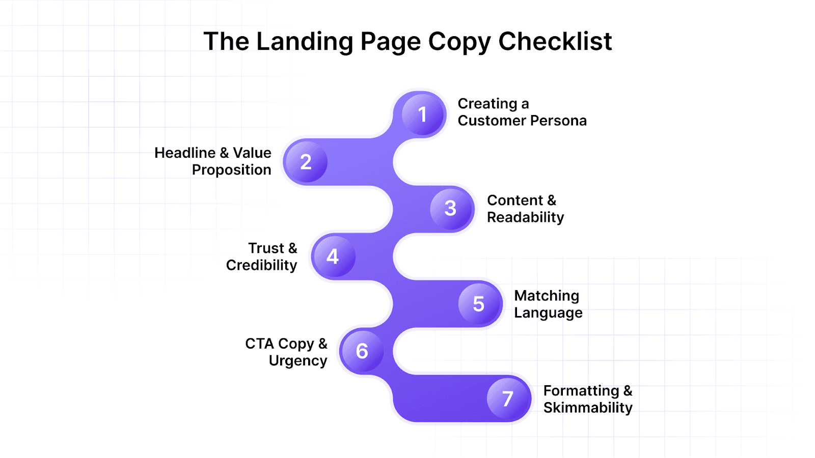
For e-commerce and DTC brands, great design grabs attention, but compelling copy drives conversions. Your landing page’s text must resonate with your target audience, build trust, and prompt action. Here’s a checklist to align every word on your page with user intent and buying behavior.
1. Creating a Customer Persona
You can’t write for “everyone” and still be effective; generic messaging gets ignored. Start with a clear understanding of who you’re talking to and what matters to them.
Define age, goals, motivations, and hesitations: Develop a clear mental picture of your target shopper. This clarity helps you write copy that directly speaks to their needs and concerns.
Use actual user language from reviews or support chats: Pull in real-world phrasing to sound natural and familiar. This makes your messaging feel relatable, rather than forced or out of touch.
2. Headline & Value Proposition
Your headline is the entry point to the entire page. If it’s weak or confusing, users will bounce, no matter how great the product is. Make your promise clear and relevant, with no ambiguity.
Does your headline say what you do? Users should instantly understand what your product is and why it matters. Avoid metaphors or slogans unless paired with a direct subheadline.
Does it mention the outcome or benefit? Focus on the result users care about. Frame your e-commerce product as a solution to a problem, not just a tool.
3. Content & Readability
Even interested users won’t read dense blocks of text. Your job is to deliver key messages quickly and clearly. Good readability improves comprehension and keeps people engaged longer.
Use short paragraphs and bullets: This enhances visual flow and helps reduce friction, particularly on PDPs or PLPs.
Use active voice, plain English: Avoid passive phrases or corporate language that feels distant. Write like a smart friend giving helpful advice, not like a textbook or brochure.
4. Trust & Credibility
Shoppers are often skeptical, especially in the DTC space. Your copy must establish trust and reassure visitors that they’re making the right decision.
Mention the number of users/customers: Quantify success to provide social proof. Phrases like “trusted by over 10,000 shoppers” help validate your product’s credibility.
Awards, guarantees, or certifications: Display trust badges, money-back guarantees, or secure checkout seals to reduce perceived risk and reinforce your legitimacy.
5. Matching Language
Your tone should match the mindset and expectations of your audience. If it feels off, they’ll disengage. Language is how you show users they’re understood.
Reflect their tone (playful, smart, bold?): Choose words that feel native to your shopper’s world.
Avoid corporate fluff or vague buzzwords: Use concrete language that highlights specific benefits instead of overused terms like “innovative” or “cutting-edge.”
6. CTA Copy & Urgency
The CTA is the final nudge that turns curiosity into action. It needs to be specific, inviting, and time-sensitive. Weak or generic CTAs are a wasted opportunity.
Use action verbs (“Try,” “Get,” “Start,” “Buy”): Begin with a verb that clearly communicates what will happen next. Avoid bland phrases like “Submit” or “Learn More” unless absolutely necessary.
Add urgency: Incorporate phrases like “limited stock,” “sale ends today,” or “only 100 left” to motivate immediate action, especially in cart abandonment scenarios.
7. Formatting & Skimmability
Most users skim before they commit to reading. Your layout should help them spot what matters fast. Good formatting makes your content digestible and keeps readers moving down the page.
Use visual hierarchy (headlines > subheads > text): Guide the shopper’s eye logically using font size and weight. This helps the user navigate from landing page to PDPs to checkout smoothly.
Highlight key phrases or numbers: Use bold, color, or icons to draw attention to key selling points. Just don’t overdo it; too much formatting can be as confusing as none at all.
Suggested Read: How to Create Personalized Landing Pages for Increased Engagement in 2025?
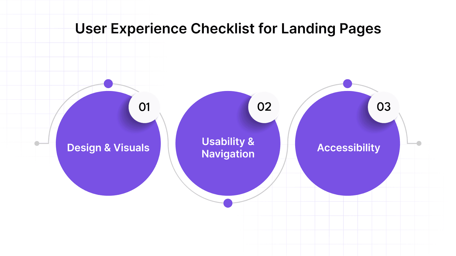
The User Experience Checklist for Landing Pages
Great copy and visuals won’t drive conversions if your e-commerce landing page is hard to navigate or frustrating to use. Below are key UX elements that directly impact the performance of your DTC landing page, from PDPs to checkout:
1. Design & Visuals
Visual clarity is essential for helping users quickly understand your offer and feel confident in your brand. The design should support content and guide the shopper, not overwhelm or confuse them.
Use consistent fonts, colors, and icon styles: A cohesive design creates visual trust and keeps the experience seamless. Inconsistent styling can make your brand feel unpolished and disrupt the user journey across commerce surfaces, such as PLPs or shopping bags.
Avoid stock photos; show the real product or UI: Stock images can feel inauthentic. Use real product images, product demos, or lifestyle photos to help users envision themselves using your product.
Mobile-first: Since most e-commerce traffic comes from mobile devices, ensure that CTAs, text, and images are optimized for easy navigation, without the need for zooming or horizontal scrolling, especially on PDPs and checkout pages.
2. Usability & Navigation
E-commerce landing pages should be intuitive and guide users naturally from interest to action. If users struggle with navigation, your conversion rate will drop, regardless of how great the offer is.
No top navigation (unless it’s part of the product): Focus users on the primary CTA and prevent distractions by removing menu bars or other elements that could lead them away from their goal, particularly on landing pages and shopping bags.
Button clicks should be obvious and responsive: Ensure CTAs are highly visible, clearly clickable, and provide feedback when tapped. Avoid links that blend into the background or lack contrast, especially in cart abandonment strategies.
Forms should auto-format and validate inputs: For checkout pages, allow users to fill out forms easily, with real-time error messages to guide them. Make sure that the form is streamlined for quick completion, reducing friction and cart abandonment.
3. Accessibility
Making your landing page accessible is essential, not just for inclusivity but also for improving usability across the board. An accessible e-commerce site is more likely to convert, load faster, and reach a wider audience.
Add alt text to all images: Use descriptive alt text for all images on PDPs and PLPs, improving SEO and accessibility for screen readers.
Use color contrast that’s easy to read: Ensure text stands out against the background in all lighting conditions, especially for users browsing on mobile devices or in varied environments.
Make the page navigable by keyboard: Ensure every interactive element, CTA, form, and link is reachable without a mouse. This is especially important for users with limited mobility or assistive devices.
With Nudge’s omnichannel compatibility, your e-commerce site delivers a consistent, personalized user experience across all touchpoints. Be it the homepage, browsing PLPs, interacting with AI product recommendations, or checking out, Nudge ensures your landing pages and funnel personalization are aligned with their behavior.
The SEO Checklist for Your Landing Page
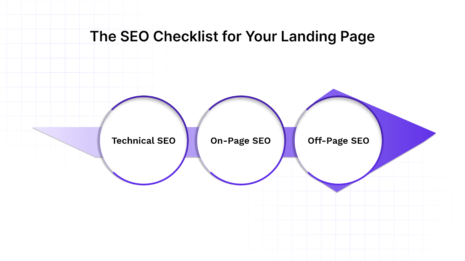
If your e-commerce landing page isn’t discoverable, you’re missing out on valuable organic traffic. Below is a checklist of key SEO elements to implement across technical, on-page, and off-page areas for maximum visibility and conversion:
1. Technical SEO
Technical SEO ensures that your landing page is visible, indexable, and fast, which directly impacts its ability to rank in search engines.
Ensure fast loading (under 3 seconds): Page speed affects both SEO rankings and bounce rates. Compress images and assets, enable caching, and optimize code for better performance on PDPs, PLPs, and checkout pages.
Use HTTPS: Ensure your SSL certificate is active and your URL uses “https” to provide a secure experience for users, particularly in cart abandonment scenarios.
Use responsive design and mobile viewport tags: Mobile optimization is critical, as mobile usability is a major ranking factor for DTC brands.
2. On-Page SEO
These are the elements that search engines and users directly interact with on your landing page. On-page SEO helps improve rankings, relevance, and click-through rates from search.
Use your main keyword in key areas: Include it in the page title, H1, URL, meta description, and alt text. For instance, if your landing page is optimized for “landing page checklist”, ensure it naturally appears in the key areas across your commerce surfaces.
Add meta title and description: Meta titles and descriptions are what appear in search results and influence click-through rates. Keep titles under 60 characters and descriptions under 160 to optimize visibility for relevant e-commerce queries.
Use schema markup for FAQs: Schema markup makes your FAQ section eligible for rich snippets in search results, boosting visibility and giving your page more real estate in search, improving user engagement, especially for checkout-related questions.
3. Off-Page SEO
Off-page SEO isn't required for every landing page, but it can support campaigns and long-term visibility. If you're driving traffic from outside sources, these strategies help amplify reach.
Backlinks from relevant domains help: External links act as trust signals for search engines. Partner with publications, affiliates, or influencers to earn natural backlinks.
Link from internal blog pages or homepage: Drive traffic from your main site to your landing page by linking contextually from blogs or homepages, boosting internal SEO and distributing page authority.
Share on social for indexing and traffic: While social signals don’t directly affect rankings, sharing your landing page on social media speeds up indexing and drives referral traffic, which can improve engagement metrics across PDPs and PLPs.
Nudge allows you to customize these elements for each user, ensuring that your landing page feels tailored and relevant. With Nudge's 1:1 Personalization, you can adjust the content and CTAs based on each visitor's previous behavior, ensuring that your e-commerce landing page is optimized for SEO performance at every step of the funnel.
Now that we have a solid landing page checklist in place, let’s explore how you can implement it step by step to maximize its impact.
How to Implement the Ultimate Landing Page Checklist?
To build a high-converting landing page for your DTC brand, it’s crucial to focus on structure, copy, user experience (UX), and SEO. Follow this step-by-step approach to optimize your landing page for maximum impact, ensuring it aligns with your e-commerce goals and drives conversions.
Step 1: Define the Goal of Your Landing Page
Clearly define the objective of your landing page, whether it’s driving product sales, capturing leads, or encouraging event sign-ups. Ensure that every element on the page, from CTAs to product recommendations, supports this goal. A clear purpose guarantees that your PDPs, PLPs, and checkout align with the visitor’s intent, driving them toward the desired action.
Step 2: Structure Your Landing Page for Maximum Impact
Start with a strong hero section that instantly communicates value through a clear headline and subheadline. Follow with a problem-solution layout, guiding users through the benefits of your product. Position CTAs strategically and incorporate social proof to build trust. Keep images, content, and product recommendations minimal to avoid distractions, ensuring users focus on taking action, from browsing to checkout.
Step 3: Craft Compelling and Clear Copy
Write a clear headline and value proposition that emphasizes the benefit of your product or service. Keep copy concise and easy to scan, using bullet points and bold text to highlight key benefits. Add urgency in your CTAs to encourage immediate action and boost conversions, especially during critical moments like cart abandonment.
Step 4: Enhance User Experience (UX)
Make sure your landing page is mobile-responsive, as a significant amount of e-commerce traffic comes from mobile devices. Ensure a smooth user journey with a clear visual hierarchy, guiding users toward CTAs. Optimize the page for fast loading times, especially on PDPs and PLPs, and minimize unnecessary navigation to keep users focused on their goal: conversion.
With Nudge, you can trigger real-time, personalized messages, like exit-intent popups and urgency nudges, based on user behavior to drive conversions. Contextual Nudges engage users across PDPs, PLPs, and shopping carts, optimizing conversions.
Step 5: Optimize for SEO
Make sure your headline, copy, and meta tags contain relevant keywords to increase the visibility of your page in search results. To further improve SEO, use alt text for internal links and images. These steps ensure your landing page ranks higher and attracts organic traffic from search engines, helping you reach more potential customers and drive relevant traffic to PDPs or PLPs.
Step 6: Test and Iterate
Implement A/B testing to compare different versions of your landing page and identify which elements perform best, such as CTAs, product bundles, or contextual nudges (e.g., popups and banners).
Track conversion rates, bounce rates, and cart abandonment using analytics tools to refine the page continuously. Ongoing testing and iteration will ensure your e-commerce landing page continues to improve, providing the best experience for each shopper.
After understanding how to implement the checklist, let’s look at real-world examples to see how these principles come to life.
Real-World Landing Page Examples
A great landing page isn’t just well-designed; it’s structured around clarity, persuasion, and ease of use. The following examples showcase companies that have mastered the fundamentals, from structure and copy to trust elements and design.
1. FitFuel
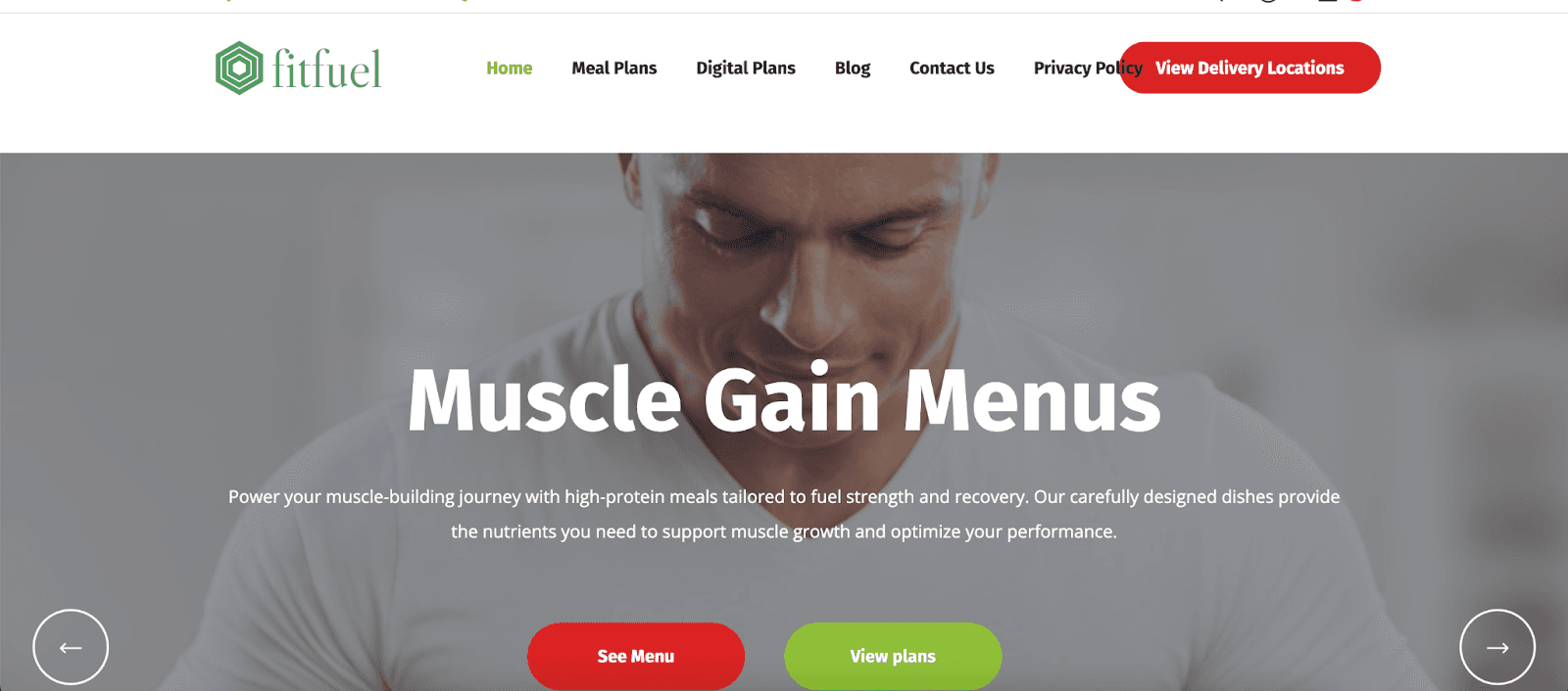
FitFuel’s landing page targets fitness enthusiasts with a performance-driven design. The hero section showcases vibrant product imagery with a concise, benefit-focused headline. Social proof, including athlete testimonials, builds trust, while clear nutritional information and certifications add credibility.
Nudge can enhance FitFuel's hero section by adjusting the headline and product imagery based on user behavior, increasing relevance and engagement.
2. Athletic Greens
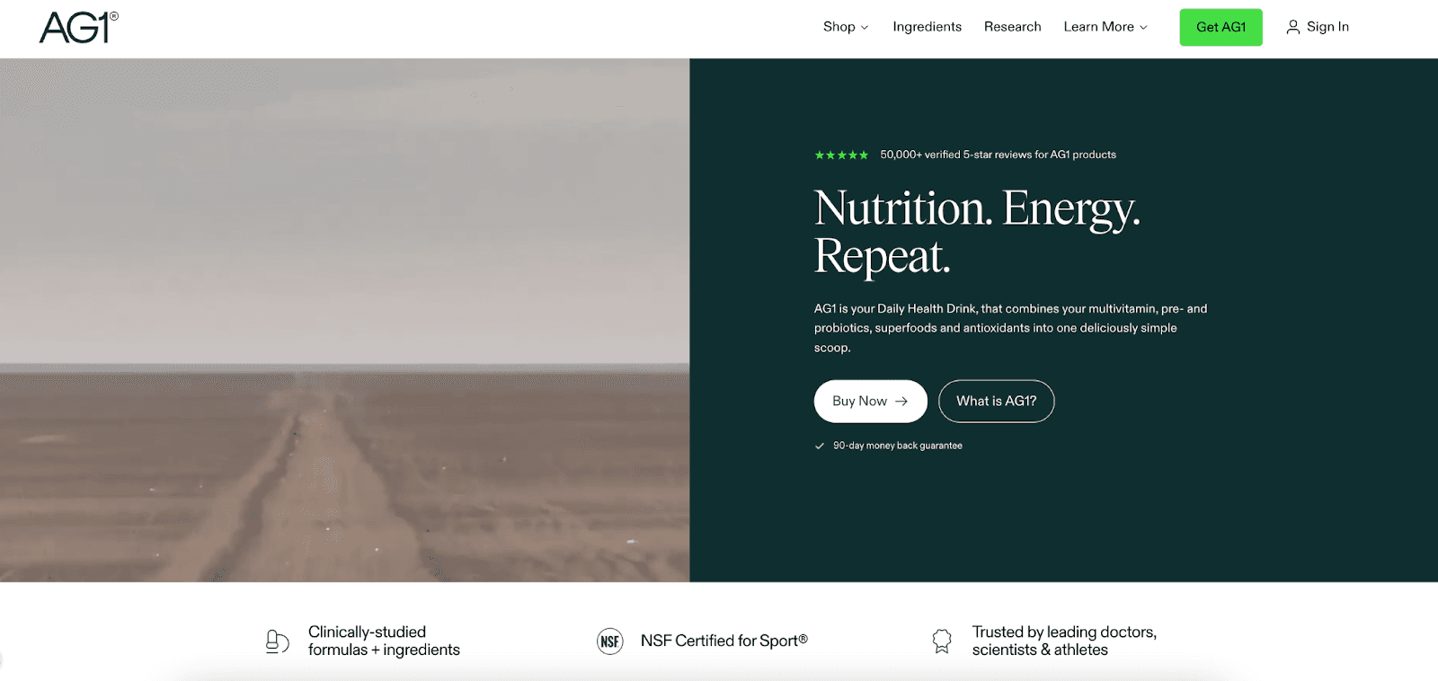
Athletic Greens uses a clean, lifestyle-oriented layout that speaks directly to health-conscious buyers. The hero section combines product imagery with a simple, benefit-focused headline that encourages curiosity.
By integrating AI-powered product recommendations, Nudge tailors upsell bundles on PDPs based on browsing history and category affinity, boosting additional purchases.
3. ASOS
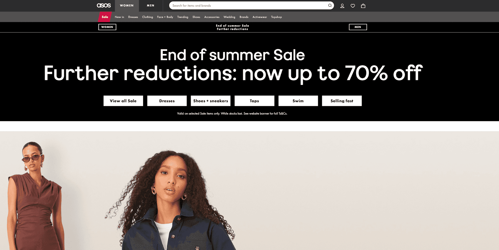
ASOS uses a clean, fashion-forward layout that speaks directly to young, trend-conscious shoppers. The hero section showcases vibrant, high-quality images of models wearing the latest collections, paired with a bold, benefit-focused headline encouraging shoppers to "Shop the Look" and stay ahead of the trends.
To combat cart abandonment, Nudge triggers exit-intent popups, offering personalized discounts or reminders to prompt users to complete their purchase.
Suggested Read: 7 Principles to Create High Conversion Landing Page
Now that we’ve seen successful examples, let’s discuss how to optimize your landing pages for the best results using the power of data activation with Nudge.
Optimize Your Landing Pages with Nudge
In 2025, data activation is crucial for creating landing pages that convert. With Nudge’s AI-driven platform, you can ensure your landing pages are not just well-designed but also data-driven and personalized in real time.
Here’s how Nudge’s key features integrate into your Landing Page Checklist to elevate the user experience:
Commerce Surfaces
Ensure your landing pages are optimized for every shopper’s journey with AI-powered landing experiences. Nudge personalizes content across the funnel, from landing pages, PDPs, and shopping bags, by embedding interactive commerce widgets like product grids, personalized offers, and shoppable videos.
AI Product Recommendations
Integrate product recommendations across your landing page to increase relevance and engagement. Nudge tailors these recommendations based on real-time shopper behavior, product affinities, and browsing patterns. Smart upsell bundles are contextually placed on PDPs, cart, and checkout pages, ensuring that every recommendation adds value and drives more conversions.
Contextual Nudges
Consider using contextual nudges to engage visitors on your landing page based on real-time behavior. Whether it’s an urgency message, exit-intent popup, or personalized offer, Nudge ensures that the right message is delivered at the right moment—whether it’s through modals, sticky banners, or popups. This helps boost conversions and reduce cart abandonment, making your landing page more effective.
Real-Time Content Optimization
Nudge’s AI Decisioning feature adjusts content, layout, and UI elements based on live shopper behavior, such as browsing, adding to cart, and category affinities, ensuring a personalized and engaging experience. Whether it’s the content, product recommendations, or even the layout, Nudge adapts to each shopper’s needs in real time.
Dynamic User Engagement
With Signals, Nudge tracks real-time user data, such as browsing habits and interaction patterns, and adjusts the content across product detail pages (PDPs), shopping bags, and checkout. This enables tailored product recommendations, promotions, and offers, improving user engagement and driving conversions throughout the funnel.
Increasing Engagement with Rewards
Nudge’s Gamification and Rewards features boost user engagement by rewarding specific actions, like signing up or completing tasks. This encourages repeat interactions and increases the likelihood of conversions, turning the user experience into a more interactive and motivating journey.

With Nudge’s comprehensive feature set, you’ll enhance user experience, drive conversions, and stay ahead of the competition.
Conclusion
A high-performing landing page isn’t built by chance; it’s the result of clear structure, thoughtful messaging, and user-first design. When every section serves a purpose and every word leads to action, you turn casual visitors into committed users.
This landing page checklist gives you the foundation to build with intention and iterate with confidence. From layout to copy, from mobile responsiveness to SEO, it ensures that nothing critical is overlooked. When applied consistently, it doesn’t just improve conversions; it strengthens your brand experience.
To make sure your landing pages are tuned for performance, Nudge offers a suite of tools to automate decision-making, personalization, and continuous user engagement.
Book a demo to enhance your landing page performance and turn every interaction into a conversion with AI-driven insights
FAQs
1. How is a landing page different from a homepage?
A landing page minimizes all distractions and concentrates on a single action, like making a purchase or signing up. A homepage, on the other hand, contains multiple links and broader information about the company.
2. How many CTAs should my landing page have?
Use one primary CTA throughout your landing page, ensuring it’s clear and focused. Multiple CTAs could confuse users or split their attention, so keep the path to conversion simple and direct, especially on pages like PDPs and checkout.
3. Should landing pages always be short?
Not necessarily. Short pages work well for simple offers, while longer pages help explain complex or high-value products. Tailor your page length based on what users need to feel confident enough to convert, whether it's on a PLP or shopping cart page.
4. Can I use the same landing page for ads and organic search?
You can, but it’s more effective to personalize the content for each traffic source. Ad traffic may require urgency or a discount, while organic traffic often seeks more information or social proof. Adapt your messaging on landing pages or PDPs accordingly. Nudge helps you do this. We help you personalize every landing page or PDP your audience lands on after clicking on an ad, an email, or a push notification.
5. How often should I update or test my landing page?
Review your landing page performance regularly and run A/B tests on key elements like headlines, product recommendations, or CTAs. Testing different variations can significantly improve conversion rates and optimize user experience across PDPs, PLPs, and cart abandonment.
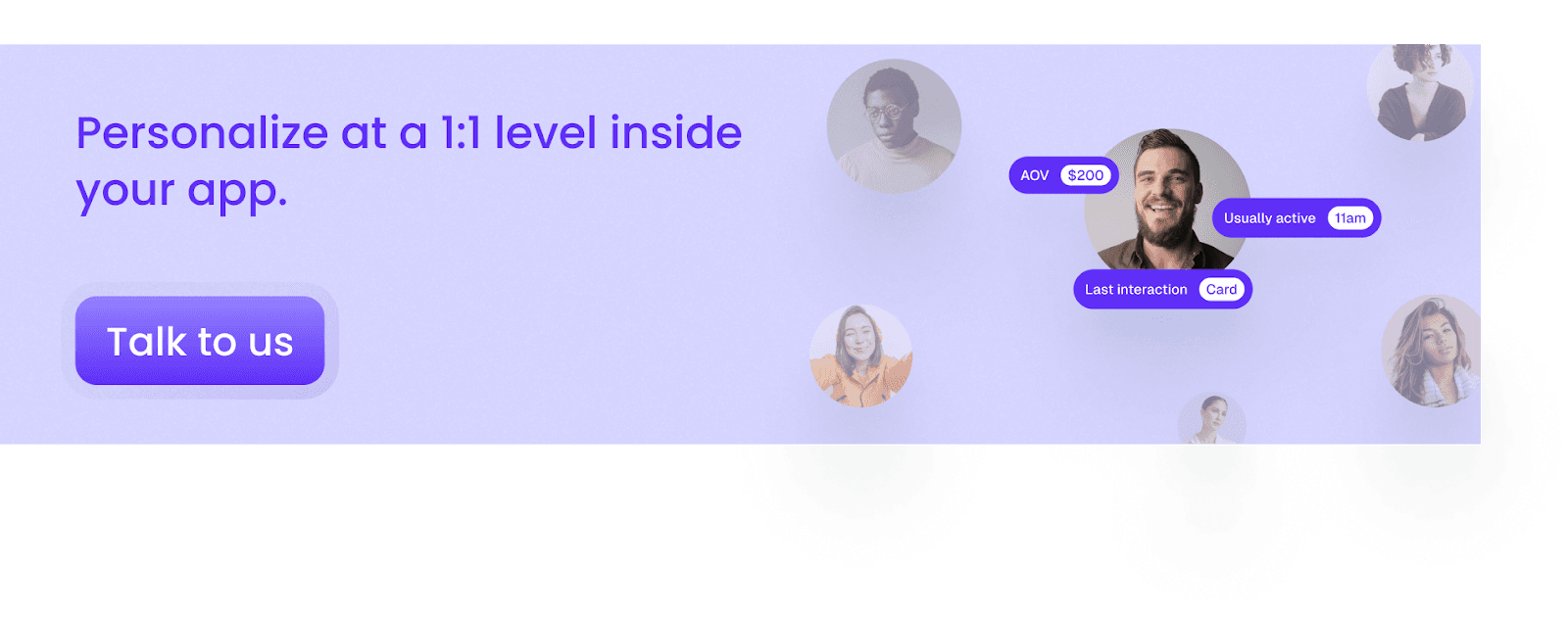
Ready to personalize on a 1:1 user level?